
Colour, Tone, Shadow, Line

ALLEN W. SEABY & THE ART OF THE COLOUR PRINT
“The colour print may reveal the most beautiful and delicate form …”
– Allen W. Seaby
Colourful images built up from designs carved into blocks of wood was a method of printmaking mastered by ukiyo-e artists of the late Edo period in Japan. When such works became known in Europe from the mid-nineteenth century onwards, a group of artists, struck by their beauty, were inspired to adopt and experiment with their methods.
Allen W. Seaby, Professor of Art at the University of Reading from 1920-1933, was an influential champion of the Japanese woodcut method in Britain. He learnt the art in Reading from his friend and colleague Frank Morley Fletcher (1899-1949). Alongside making his own prints, Seaby went on to teach the process and, in 1925, wrote a how-to handbook Colour Printing with Linoleum and Woodblocks.
This exhibition highlights Seaby’s mastery of the colour print. By setting his work among that of his students, colleagues, friends and family, it demonstrates the enduring influence of his teaching and those he inspired through his love of colour print.
Heron by Allen W. Seaby
Widely acknowledged as one of his best works in the medium, this sublime low-angle study of a heron hidden among the reeds, his beak playfully piercing the black line that frames the print, comes from an early period in Seaby’s printmaking career (c.1903-1908).
In 1905, Seaby took over from Frank Morley-Fletcher as teacher of the class ‘woodcuts in colour’ based on ‘Japanese practice’, at a point that he was beginning to build an international reputation as a master of colour print. An impression of this print was exhibited in a Bond Street Gallery in 1908, and was acquired as part of a set of Seaby’s prints by the Victoria and Albert Museum.
Image: Allen W. Seaby (1867-1953), Heron, by 1908, colour woodcut on paper, [TYP/AS/32].
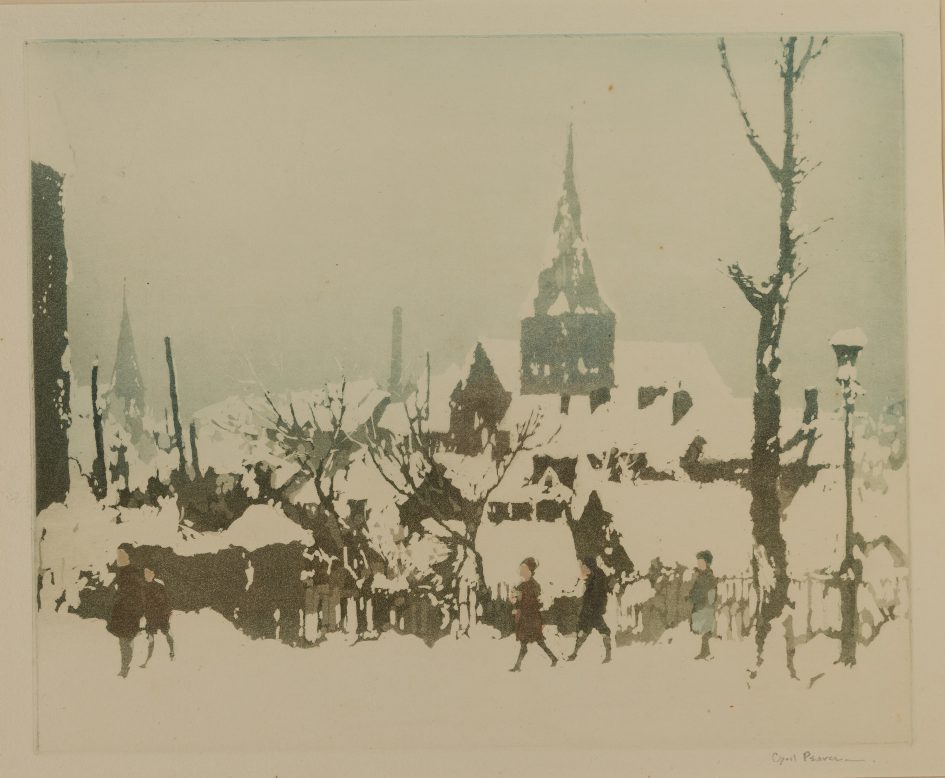
Winter landscape in blue by Cyril Pearce
An art student at University College Reading until 1907, where he would have studied the colour woodcut method under Seaby, Pearce later became a lecturer in Design and Composition in Seaby’s department at the University and authored a manual entitled Composition on the principals of pictorial design in 1927.
In this winter landscape, possibly after a scene sketched locally, we see Pearce experimenting with the effects of colour and tone on the composition, most prominently through switching the dominant background hue from blue to brown. In place of another coloured block, he makes effective use of the white page to pick out the snow-covered rooftops and foreground.
Image: Cyril Pearce R.B.A (1882-1967), Winter landscape in blue, 1929, colour woodcut on paper, [TYP/AS/34].
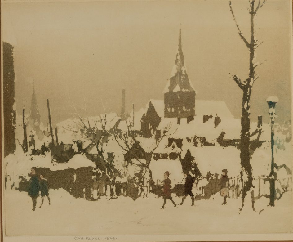
Winter landscape in brown by Cyril Pearce
An art student at University College Reading until 1907, where he would have studied the colour woodcut method under Seaby, Pearce later became a lecturer in Design and Composition in Seaby’s department at the University and authored a manual entitled Composition on the principals of pictorial design in 1927.
In this winter landscape, possibly after a scene sketched locally, we see Pearce experimenting with the effects of colour and tone on the composition, most prominently through switching the dominant background hue from blue to brown. In place of another coloured block, he makes effective use of the white page to pick out the snow-covered rooftops and foreground.
Image: Cyril Pearce R.B.A (1882-1967), Winter landscape in brown, 1929, colour woodcut on paper, [TYP/AS/34].
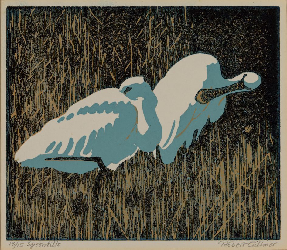
Spoonbills by Robert Gillmor
Seaby’s grandson, Robert Gillmor, has followed closely in his grandfather’s footsteps when it comes to his passion for colour print, wildlife, and birds. Gillmor studied at the University of Reading and produced his first illustrated book, A Study of Blackbirds, whilst he was still a schoolboy. He embarked on a full-time career as a wildlife artist in 1965 and is renowned, above all, for his striking colour-linocuts.
This pair of spoonbills, like many of Gillmor’s prints, is based on sketches he produced in the field along the Norfolk coast. With their long-legs and simple, bright plumage, spoonbills provide ideal subjects for Gillmor’s linocuts, where the visual impact is based on contrast; as he put it “This is no medium for little brown, streaky jobs that skulk in bushes.”
Image: Robert Gillmor (1936-2022), Spoonbills, 1992, colour linocut on paper, [UAC/10163]
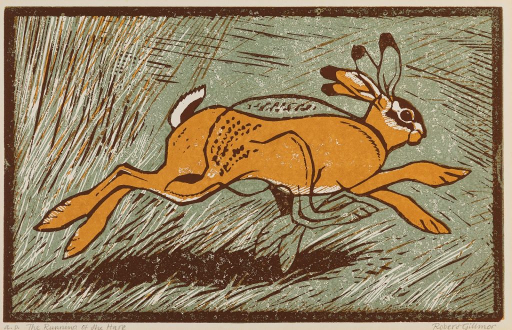
The Running of the Hare by Robert Gillmor
Gillmor describes this print, which superimposes two images of a hare in extreme attitudes as it runs across a field, as the result of “doodling” or “chasing an idea around on a pad of cheap paper until it begins to come under control”. The idea here is to convey the movement of the hare, with the bottom coloured image showing it stretched out as it flies forward, and the top image, seen only in outline, showing its feet tucked beneath it, primed to kick-off once more.
The print is part of a pair, with a second entitled Leaper’s Leap, and belongs to larger number of Gillmor’s prints featuring hares drawn from sketches made on the Norfolk nature reserve and in local fields.
Image: Robert Gillmor (1936-2022), The Running of the Hare, 1992, colour linocut on paper, [UAC/10305]
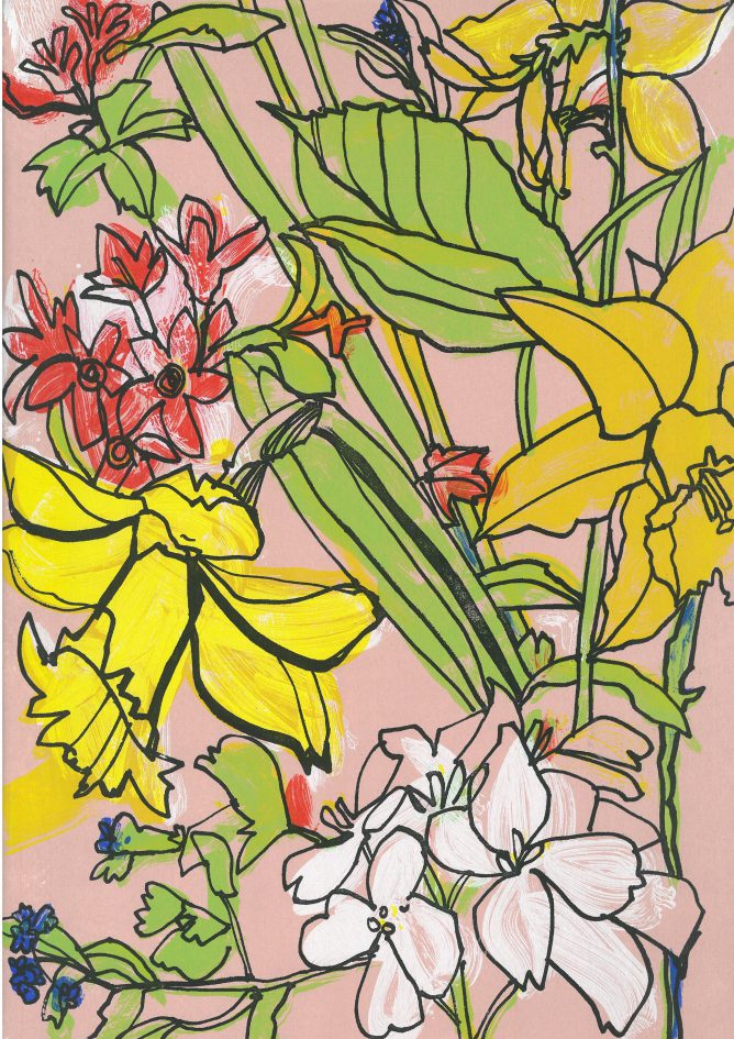
Anna’s Spring Garden by Emily Gillmor
This is the first print Seaby’s great-granddaughter Emily Gillmor printed at the Institute of Education, where she is currently the Printmaker in Residence. Emily followed in the family tradition and studied Drawing and Painting with Printmaking at Edinburgh College of Art. However, Emily has tended to steer clear of animal wildlife for her subject matter, preferring instead to observe flowers, kitchenalia and other interesting still life.
Emily focuses on silk screen prints, gouache paintings and drawings. In recent years Emily has been experimenting with more texture in her work, incorporating different mediums to create emotional and evocative work.
Image: Emily Gillmor (b. 1960), Anna’s Spring Garden, 2014, screenprint, [UAC/11131]